RIT News Reskin
Overview
With the current RIT news site's disorganization and unclear navigation and hierarchy, I modified the branding and created a new and improved look and feel to the RIT news site. Since the target audience is mostly students and faculty, creating a news site that adheres to what a student should feel (excitement and youth) is important to grab attention. As a result, information architecture, style, and feeling of the site is what is most important in displaying a lot of information towards a user.
Problem
While researching and diving further into what and visual design is, I took the liberation to redesign and the RIT News website to create something that connects well to the audience: those who are alumni to the school, current students, parents, and faculty. To do this, I needed to reorganize the information in a way that was visually compelling as well as exciting for any type of person of any background to easily navigate the website.
Research
First, I took a look at the current RIT News website. At first glance, it looks clean, fits with the student oriented theme, and displays information in a way that seems organized and well put together.
So, why reorganize it and completely change the layout and colors? Because the project is to redesign the entire page into something that’s easier to read, navigate, and create a spacious and seamless experience without being overwhelmed with information of different sections of the website.
I really wanted to narrow it down to a particular reader, a student who goes to RIT, to enjoy their time reading a completely separate website different from the current RIT colors and style. News is something that is enjoyed through either newspapers or news sites, and does not combine well with being part of rit.edu because it doesn’t reach the wider range of the audience.
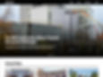
Current RIT News Website


Design Process
The method of my design process is going back and forth between sketches, user flow, prototyping, and designing the layout in full color. The way this project was handled was not in a straight line, but going back and forth, conducting user interviews and iterations, and testing to see how successful it is.
Sketches
My idea for this project was to create sections that represented each time. It has changed significantly over through to the final version because I have realized that making something pretty does not always mean it's functional.


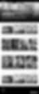
Hi-fi Wireframes
Starting off with an idea, I create those ideas into a clean presentation, create a layout with pictures to picture what it would look like.
Here, my preliminary idea can be seen to be clean, though the organization of my thoughts and the hierarchy of the information was not clear to a student of RIT. What I wanted to present here the most was captivating pictures, which people seem to be attracted to the most when viewing a news website because some people are just too lazy to read.
My idea before was to split each category into each different college RIT presents, but later scrapped it because having the user scroll all the way down just to find out that the news they wanted to find isn’t even in that category is frustrating.
The first wireframes were a learning experience for me, taking my research and trying to create something that looked pretty, rather than thinking too much about its functionality.
Preliminary Composition
Choosing colors, fonts, and layouts was something I had to research about the current trends and fonts that appeal to younger viewers. I wanted to make this website a clean and sporty look to it, looking both fresh and open for all kinds of students.
So, what was the problem with this?
The headlines are large and makes the user uncomfortable seeing such large categories. The information it too tight and the all caps letters are hard to read. The only separation between each category is the giant headlines.
What I want to improve: Creating something visually appealing and matches the same narrative throughout the entire front page. Each section should have some sort of movement and connection with the user.

Solution
I stuck with the same bold colored blue, and got rid of the distracting yellow for each section, but left it in the sports to add that extra boldness and punch to it. Grouping information made it easier to navigate and guides the users eyes throughout, creating a seamless experience that brings the user wanting more to read.